BLOG ARTICLE
How to make podcast cover art and episode thumbnails - Tips and Examples
Last updated: 4/5/2026
Last updated: 4/5/2026
Creating compelling visuals for your podcast is about balancing your show's identity with eye-catching design. This guide breaks down podcast cover art vs. episode thumbnails, and provides concrete tips, tools, and advanced techniques to level up your podcast’s visual branding.
Try Our Free Episode Thumbnail Generator
Podcast Cover Art vs. Podcas Episode Thumbnails
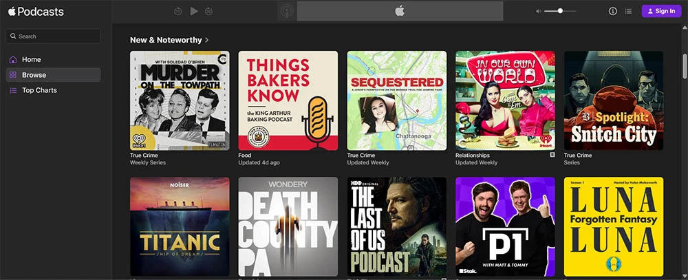
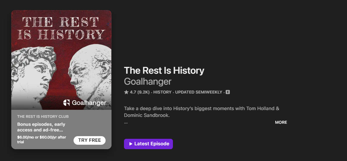
Podcast Cover Art is the main image that represents your show across all platforms. It's the square artwork that appears in podcast directories (Apple Podcasts, Spotify, etc.) and on listeners’ devices as the show’s icon.
This is essentially your podcast’s logo – a static image used for all episodes. Because it’s omnipresent, cover art should encapsulate your show's identity at a glance.
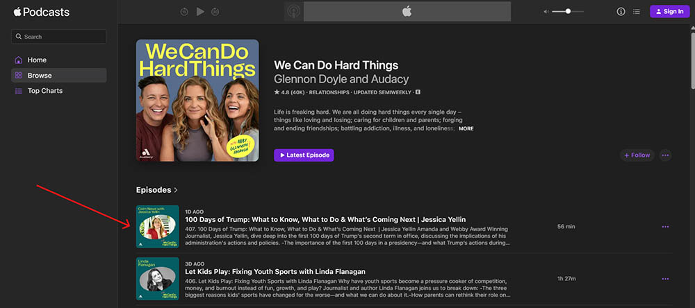
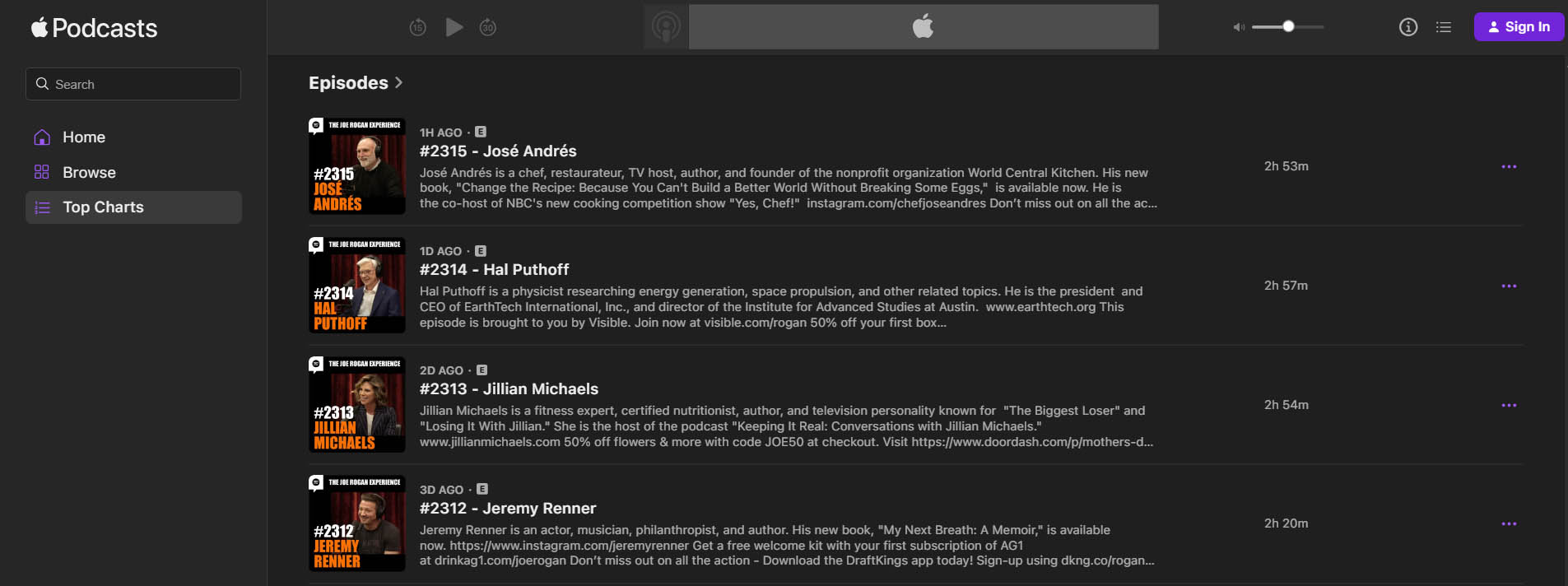
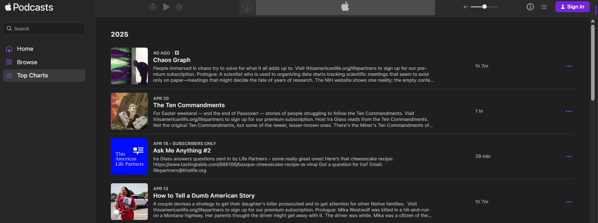
Episode Thumbnails (Episode-Specific Artwork) are unique images for individual episodes.
These might be used on platforms like YouTube (for video versions or audiograms of your podcast), social media posts promoting an episode, or podcast apps that support episode-specific art.
Not all podcast players display episode thumbnails, but some (including Apple Podcasts since iOS 17) do support them if provided.
Episode art allows you to highlight a particular guest, topic, or theme from that episode, differentiating it from your main cover art.
Unlike the permanent cover art, episode thumbnails can be tailored to each episode’s content.
For example, you might include the guest’s photo or an illustration of the topic in that episode's thumbnail.
However, it's important that episode art still aligns with your overall branding – it should look like it belongs to your podcast.
Also, avoid simply repeating the episode title on the thumbnail; many apps already show the episode title alongside the image, so redundant text can clutter the design. In short, use episode thumbnails to complement your main cover art, not to duplicate it.
Apple’s guidelines even note that your episode art should have a distinct visuals from the show cover (so they aren’t identical), since the two might be displayed together in their app.
Designing Impactful Podcast Cover Art (Beyond the Basics)
Your cover art often forms a listener’s first impression, so design it to be striking and clear even at small sizes.
-
Keep Text Minimal and Meaningful: Limit text to your podcast name (and avoid unnecessary words like "Podcast" in the title area). The more text you cram in, the harder it is to read on a tiny thumbnail. A good rule of thumb is to use five words or fewer on your cover – often just the show name. If you have a tagline, consider leaving it out of the cover art or using a subtle, secondary font, because it likely won’t be legible at small sizes.
-
Choose Clean, Readable Fonts: Opt for bold, sans-serif typefaces or other highly legible fonts. Fancy scripts or overly decorative fonts lose clarity when scaled down. Stick to one or two font families maximum for a clean look. Consistency in typography will also reinforce your branding across your cover and episode graphics.

-
High Contrast for Tiny Thumbnails: Design with contrast in mind. Use bold colors and strong contrast between text and background so that your title and imagery pop even at small sizes. For example, light text on a dark background (or vice versa) tends to be more readable. Also, stick to a simple color palette – around 2-3 primary colors – to avoid a busy look. This doesn’t mean your art must be plain, but any additional colors should complement each other and not overwhelm the viewer.
-
Avoid Clutter and Overused Imagery: Simplicity sells. Don’t overcrowd the art with too many elements; one focal image or icon is usually enough. Remember that less is more when your art gets shrunk to thumbnail size. Also, be careful with cliché images – a microphone, headset, or RSS icon can be overused in podcast logos. Unless it’s core to your brand identity or you’ve given it a fresh twist, consider using more unique imagery that reflects your podcast’s theme. Original illustrations or symbols can set your cover apart from the sea of lookalike podcast graphics.

-
Represent Your Brand and Tone: Your cover art should instantly convey your podcast’s genre or vibe. If it's a tech podcast, maybe your imagery/style is sleek and modern; for a history podcast, perhaps it’s vintage or textured. Use imagery and color that align with the mood of your content. Make sure any logo, icon, or character you include is clearly associated with your show’s theme or title. Essentially, a potential listener should get a hint of your podcast’s content and tone just by looking at the cover. Keep your branding consistent – if you already have brand colors or a logo, incorporate those so that your podcast art is on-brand with your other materials (website, social media, etc.).
-
Test for Scalability: This is a pro tip that’s often overlooked – after designing your cover, test it at small sizes. Shrink it down to, say, 50×50 pixels or view it on a phone’s podcast app listing. Is the text still readable? Can you recognize what the image is? Many designers will step back and print it small or zoom out to thumbnail size to simulate real-world viewing. If it’s illegible or muddy, go back and tweak the design (larger font, higher contrast, or simplified details). The goal is a cover that remains clear and attractive from the largest display down to the tiniest app icon.
Creating Episode Thumbnails That Stand Out
When it comes to episode-specific thumbnails, you have a bit more freedom to play with content-specific visuals, but you should still maintain a cohesive look across your graphics. Here’s how to make the most of episode thumbnails:
-
Use a Consistent Template: Design a template that you can reuse for every episode’s thumbnail. This could be as simple as a standard background with a placeholder for a guest photo or episode title. By using a consistent layout – for example, your podcast logo in one corner, a band of color or frame where the episode title goes – you create a recognizable style. This way, when someone sees any of your episode images on social media or YouTube, they instantly know it’s from your show. Consistency builds brand recognition.
-
Highlight Episode-Specific Content: Within that template, feature something unique to the episode. If you interviewed a guest, include their photo or an illustration of them. If the episode topic is a specific object or location, show it. This gives potential listeners a visual clue about the episode’s subject. Just make sure these images are high-quality and legally usable (your own photos, licensed images, or royalty-free graphics). Keep the imagery relevant and avoid cluttering the thumbnail with unrelated visuals.
-
Maintain Legible Text (or No Text at All): Many podcasters add the episode title or number on the thumbnail. If you do, keep it very short and in large, clear font – think of it more like a bold label than a sentence. Often, just an episode number or a one- or two-word hook (like “BONUS” or “Live Q&A”) can work. Remember, on some platforms the title will appear next to the image anyway (as is the case in many podcast apps), so you might choose to omit text on episode images entirely or use text sparingly. If the platform displays the title below the thumbnail, adding a long title on the image itself is redundant. Many successful shows use just a picture for episode art and rely on the platform’s text for titles.
- Adapt to Platform Requirements: Consider where these thumbnails will be seen. For example, if you're using episode images on Apple Podcasts or podcast players, you'll want them in a square format (just like cover art) at high resolution – typically 1400×1400 up to 3000×3000 pixels, JPEG or PNG. But for YouTube, thumbnails need a 16:9 ratio (1280×720 or higher). You can design your episode art with a safe center that works as a square, then extend or crop for YouTube. Some podcasters create two versions: a square one for podcast apps, and a landscape (16:9) one for YouTube or Facebook. Similarly, for Instagram, a square image works best, whereas Twitter (X) might display 16:9 better in link previews. Plan your design such that it can be easily repurposed or cropped to different aspect ratios. That might mean keeping important elements away from the extreme edges.
- Keep File Sizes and Formats in Check: Just like cover art, episode images should be optimized for web delivery. Export to JPEG or PNG in high quality but try to keep the file size reasonably small (Apple recommends under 500 KB for cover art for faster loading). A large 3000×3000 image can often be compressed to under 500 KB without visible quality loss if done right. Most editing tools let you adjust quality to reduce file size. This ensures your listeners (especially on mobile) aren’t stuck loading a huge image each time. Also, use the standard sRGB color profile (most tools default to this) to ensure consistent color display across devices.
Advanced Tips for Efficiency and Consistency
To really streamline your podcast’s visual branding and maintain a high-quality look, consider these advanced techniques:
-
Leverage AI and Smart Design Tools: You don’t need to be a Photoshop wizard to create great graphics. These days, AI-powered design tools can jumpstart your creativity. For example, you can use generative AI to brainstorm unique imagery: tools like Bing’s Image Creator or Playground AI let you type a prompt and produce custom images (which you can then refine as your cover or background). If you’re short on design ideas, they can help you come up with a concept or illustration that stands out. Additionally, user-friendly platforms like Canva and Adobe Express offer AI features and templates specifically for podcasts – Canva even has a “Magic Design” and text-to-image features to generate design variations for you. These can be huge time savers. Just remember to align any AI-generated art with your brand style (you might need to tweak colors or add your logo). The combination of AI image generation and drag-and-drop design tools means even non-designers can create professional-looking cover art with a bit of experimentation.
-
Batch-Generate Episode Graphics: If you produce episodes frequently, consider batch-creating your episode thumbnails. Tools like Canva Pro have a Bulk Create feature where you can design a template and then automatically populate it with a list of episode titles or images via a spreadsheet. For instance, you could design one thumbnail layout, connect a CSV of episode names and guest photos, and Canva will generate a batch of images in one go. This is incredibly useful for seasonal podcasts or when prepping a bunch of promotional graphics.
-
Create a Brand Style Guide for Artwork: Treat your podcast like a brand. Define a mini style guide for your visuals – specify your color hex codes, choose a couple of fonts, decide on a logo usage, and even settle on a general image style (e.g. flat illustration vs. photographic, edgy vs. playful, etc.). Having this guide will make it easier to enforce consistency. When using templates or hiring a designer, you can hand over your style guidelines so that every piece of artwork (cover, episode thumbnail, social media post) looks like it’s from the same family. This means, for example, if your cover art has a navy blue background and white text, your episode graphics might also use that navy blue somewhere, or the same font for titles. Consistency breeds familiarity, which is what you want as you build a listener base.
-
Use Template Libraries and Asset Kits: Expand your toolkit by using or creating template libraries. Websites like Canva, Adobe Express, and Visme have podcast artwork templates you can customize. There are even podcast-specific design kits that include cover art plus matching social media graphics. Using these as a starting point can give your podcast a unified professional look with minimal effort – just plug in your own title, colors, and images. You can also save your own templates: for example, once you design an episode thumbnail style you love, save it as a master template. Next episode, you just swap content. Over time, refine your template if needed (maybe you find a better font size for readability) but stick to a core design structure to maintain that branded feel.

-
Test and Get Feedback: Before finalizing your cover art or a new episode thumbnail style, get a second (or third) opinion. Show it to a few people (ideally in the target audience) and ask for their gut reaction. Do they understand the imagery? Can they read the text on their phone? Sometimes a fresh set of eyes catches things you missed – like a color that’s not as vibrant as you thought, or an image that could be misinterpreted. Additionally, consider A/B testing your episode thumbnails if you share them on a platform like Twitter or in newsletters: use two different designs for the same episode in different places and see which one gets more engagement. This can inform your design choices going forward. While at it, ensure that your graphics also meet platform guidelines (no important details cut off by rounded corners or UI elements, file sizes under limits, etc.) to avoid any technical snags when uploading.
Recommended Tools (Free and Paid) for Podcast Design
You don’t need a degree in graphic design to create great podcast art. Here are some free and paid tools – including AI-powered options – to help you craft cover art and thumbnails:
-
Podsqueeze Free Episode Thumbnail Generator: Our free episode thumbnail maker is designed specifically for podcasters who want professional-looking episode art without the design hassle. Simply find your podcast, select an episode and our AI will create an amazing thumbnail following the same guidelines as yout podcast cover image.
-
Canva (Free & Pro): Canva is a go-to design platform for non-designers. It offers podcast cover art templates and an easy drag-and-drop interface. On the free tier you get plenty of features, and Canva Pro (paid) adds handy tools like the Background Remover, Brand Kit (to save your colors, logos, fonts), and the Bulk Create feature for automating designs. You can also use Canva to resize designs for different platforms (e.g., one click to adapt your square cover into a YouTube thumbnail dimension). It's excellent for maintaining consistency – you can create a template for episode thumbnails and reuse it easily.
-
Adobe Express (Free & Premium): Adobe Express (formerly Adobe Spark) is Adobe’s template-based design tool. It has a variety of podcast artwork templates and a straightforward interface similar to Canva. The free version is quite capable for basic designs, while the premium (included with some Adobe Creative Cloud plans) unlocks more templates, stock images, and brand customization. Adobe Express also recently introduced some AI features (like text-to-image via Adobe Firefly) that can generate background art or stylized text for you. It’s a solid choice if you want something simpler than full Photoshop but more brand-oriented (and you can easily jump to Photoshop later if needed since it’s all Adobe).
-
Dedicated Podcast Cover Generators: There are online tools specifically marketed for podcast cover creation. For example, Jellypod and Podcast Cover Art Maker (offered by some podcast hosting companies) allow you to generate cover art by choosing styles and letting their system mix and match layout, images, and fonts. These can be hit-or-miss in terms of originality, but they’re quick. Some use AI to suggest designs based on your podcast’s theme. Another one, Placeit by Envato, provides tons of pre-made cover art and thumbnail templates – you select a design you like and just edit the text and colors in your browser. Placeit is paid (subscription or per download), but it’s known for high-quality, professionally designed templates including many podcast-specific ones.
-
AI Image Generators: If you want truly unique visuals, consider using AI image generators as part of your design process. Bing Image Creator (which uses DALL·E) is a free, user-friendly option – you type a description (e.g. "a vintage microphone on a stage with neon lights") and it creates original images you can use as a starting point. Other popular AI image tools include Midjourney (which is paid and runs through Discord) and Stable Diffusion (free, with a bit more technical setup). These tools can produce stunning artwork or fun cartoon-style avatars. Use them to create a background or central image for your cover, then bring that into an editing tool to add text and branding. Keep in mind AI outputs may need editing – you might generate several and pick the best, or tweak details. Always double-check usage rights; generally, images you create with these tools are fine to use for your own podcast, especially with tools like DALL·E or Midjourney which grant usage rights to the creator, but be cautious with any AI that uses copyrighted style or if the result accidentally mimics real logos, etc.
-
Traditional Design Software: If you have design skills or want to hire a freelancer for a polished touch, traditional tools like Adobe Photoshop/Illustrator, Affinity Designer, or free ones like GIMP (open-source Photoshop alternative) and Inkscape (for vector graphics) can be used for podcast art. They offer ultimate control. For example, with Photoshop you can design with precise guidelines, apply advanced effects, and ensure print-level quality (if you ever make merchandise of your cover art). However, these come with a steeper learning curve. A compromise approach is designing initial concepts in Canva or Adobe Express, then exporting to Photoshop for fine-tuning. If you do go pro, you can also create templates in these tools for episode art to streamline your workflow.
-
Mobile Apps: If you prefer working on your phone or tablet, apps like Over, Canva’s mobile app, or Adobe Express mobile let you create on the go. There are also niche apps like Cover Art Studio or Podcast Cover Maker on iOS/Android which provide quick cover layouts. These are handy for quick social media graphics or last-minute tweaks when you're away from your computer. Just be mindful of resolution – ensure any app you use can export high-res images (at least 1400×1400) so you don’t end up with a pixelated cover.
-
Hiring a Designer: Lastly, if design just isn't your forte or you want a truly bespoke illustration or logo, consider hiring a professional. Platforms like Fiverr and Upwork have plenty of designers who specialize in podcast cover art. Provide them with your ideas, examples of styles you like, and your title/tagline, and they can create something custom. This obviously costs more (prices can range from $50 to $300 or more for a cover design), but the result can be unique and tailored. Even if you hire out the main cover, you can ask the designer to also create a template for episode thumbnails that you can edit yourself for each episode. That way you maintain a consistent look going forward. Just ensure you get the source files (like a Photoshop or Canva template) and the rights to use the art however you need.
By following these guidelines – understanding the purpose of cover art vs. episode thumbnails, applying savvy design tips, utilizing modern tools, and meeting technical specs – you'll create visuals that not only look professional but also attract more listeners/viewers. Great podcast art grabs attention, reflects your content, and remains clear at any size, helping your show put its best face forward everywhere it appears. Happy designing!
Repurpose your podcast content with AI